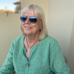
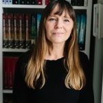
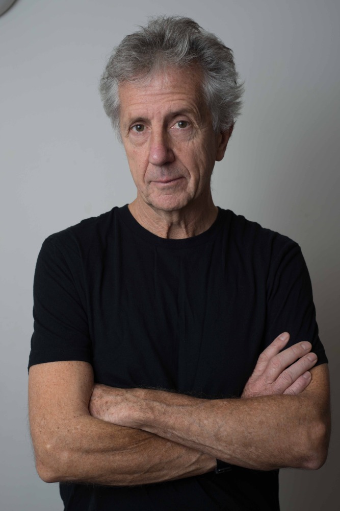
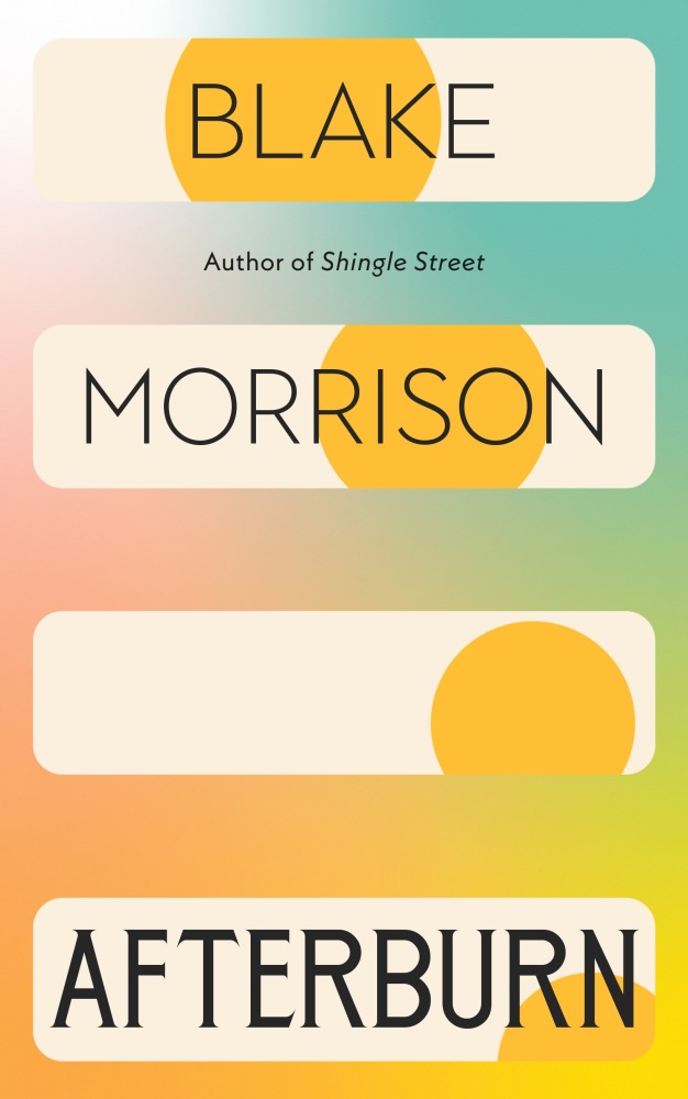
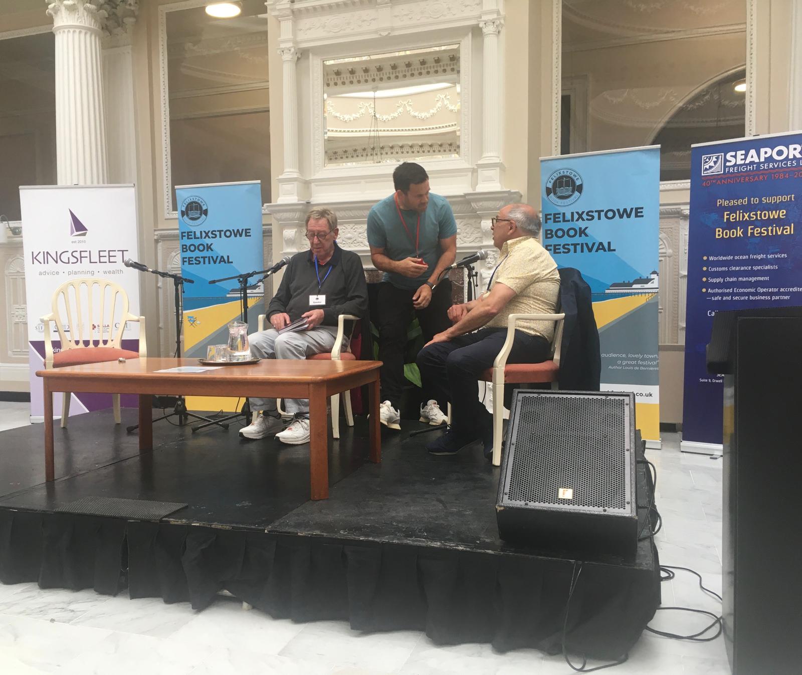
This year we’ll be treated to guest interviewer and author Wendy Jones chairing an event with fellow writer Blake Morrison. Here Wendy shares five top tips for ensuring a book event goes smoothly
It’s quite scary to interview a writer, one you are probably in awe of, in front of an audience of paying people, who are also in awe of the aforesaid writer. How do you not muck it up, bore everyone and not ask silly questions?
I’ve been interviewing writers on stage and on the radio for the last 15 years and have worked out a few guidelines that are more likely to make it work, despite nerves, despite wonky tech, despite coughing audience members, despite heckling! Even despite the security guard forcibly removing a shouting audience member. The good news is, interviewing a writer at an event is not as scary as it seems. I’m interviewing Blake Morrison at the festival and shall be fully employing the following guidelines:
1. Just make sure you’ve read the book
You don’t have to have read everything the writer’s written – which in some cases is a lot – and the writer won’t usually have expected you to, and nor will the audience. The writer will, however, have expected you to have read the book the event is about – usually their latest book. Do read it, all the way through to the end. Don’t just read the publicity sheet. Make sure you know the names of the main characters, have a line or two you can quote, and are certain how the narrative concludes. It’s always useful to have an idea of the theme or what the book is actually about and what the writer is trying to explore.
2. It’s about the author
You may have lots to say about the book or the issue the book is about. You might have anecdotes to relate and opinions to give. However, the audience have paid good money to hear the writer, to listen to him or her, and they are not usually very interested to hear any other opinion. It is the author’s event so it’s best to make it about the author and give them as much air space as possible. They will be expecting that to happen. Just chip in briefly if they flag a bit, and it’s best to help them along by asking them a question rather than giving your view of the subject.
3. Check your introduction
When you introduce the author, it is a good idea to check with them beforehand what you are going to say. There’s nothing worse that starting off an event with an author and stating a load of facts about them that they then correct in front of everyone. One way to get round this is to cut and paste their own introduction of themselves from Wikipedia or from the front of the book and read that. I usually talk to the author before we go on stage, read to them what I am going to say and let them correct before we go on stage.
4. Leave the laptop at home
It can feel reassuring and helpful to have your trusty laptop open on your lap during the event, and you might even have the book as a PDF, but it is distracting for the writer as well as the audience. Put your notes on paper and get a physical copy of the book so that you can focus fully on your interviewee. It brings more energy to the conversation.
5. Enjoy yourself
Yes, interviewing is stressful at times, and you might feel self-conscious and say something that feels a bit gauche, but that’s all okay. It’s your chance to talk and listen to someone whose work you admire and are enriched by. If you focus on them rather than yourself the event will surely flow beautifully. At the Felixstowe Book Festival, I’m interviewing my PhD supervisor, Blake Morrison. I know he’ll be fascinating and a joy to interview, as Blake is one of our most experienced writers and memoirists.
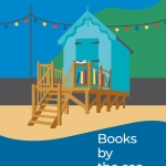
Our grateful thanks to Wendy Jones will be talking to Blake Morrison on June 28th at 1.30pm